

Introduction
In the era of big data, the ability to visualize complex datasets is crucial for making informed decisions. Artificial Intelligence (AI) has revolutionized data visualization, especially in tools like Excel. This article explores how AI can be used to visualize data in Excel, highlighting growth areas and pinpointing sectors that require attention.
1. AI in Data Visualization: An Overview
AI algorithms can analyze large volumes of data, identify patterns, and present them in user-friendly visual formats. This capability transforms raw data into insightful graphs, charts, and dashboards.
2. AI-Enhanced Excel for Data Visualization
Excel, a widely used spreadsheet tool, has integrated AI capabilities that make data analysis more intuitive and effective.
- Automated Insights: AI tools in Excel can automatically generate charts and graphs that best represent your data.
- Predictive Analytics: AI can forecast trends based on historical data, helping to project future growth or decline.
3. Visualizing Growth with AI in Excel
Imagine you have a dataset of your company’s sales over the past five years. Here’s how AI can help visualize growth:
- Trend Lines and Forecasting: Use AI to create trend lines that not only show past growth but also forecast future trends.
- Dynamic Dashboards: AI can help create interactive dashboards that update in real-time, providing a current view of growth metrics.
4. Identifying Areas Needing Attention
AI excels in pinpointing areas that need improvement.
- Anomaly Detection: AI algorithms can identify outliers or anomalies in your data, such as a sudden drop in sales in a particular region.
- Heat Maps: Use AI to create heat maps in Excel, highlighting areas with lower performance or higher risk.
5. Customized AI Visualizations in Excel
AI in Excel allows for customized visualizations based on specific business needs.
- Segmentation: AI can segment data into different categories, making it easier to analyze specific sectors or demographics.
- What-If Analysis: Use AI-driven what-if scenarios in Excel to understand the impact of different business decisions on your data.
6. Leveraging AI for Better Decision Making
With AI-driven data visualization in Excel, businesses can:
- Make informed decisions based on predictive analytics.
- Quickly identify growth opportunities and risks.
- Save time and resources in data analysis.
Hypothetical Example: Company’s Sales Data
Data Set Description
- Data: Yearly sales figures for a company over five years.
- Regions: Sales are divided into four regions – North, South, East, and West.
- Products: Sales figures are further divided into three product categories.
Excel Data Layout
| Year | North | South | East | West | Product A | Product B | Product C |
|---|---|---|---|---|---|---|---|
| 2019 | $120k | $80k | $90k | $70k | $110k | $130k | $120k |
| 2020 | $130k | $85k | $95k | $75k | $115k | $135k | $130k |
| 2021 | $135k | $90k | $100k | $80k | $120k | $140k | $135k |
| 2022 | $140k | $95k | $105k | $85k | $125k | $145k | $140k |
| 2023 | $145k | $100k | $110k | $90k | $130k | $150k | $145k |
I’ll create a simulated visualization based on the provided Excel data. This visualization will include a trend analysis graph, a heat map for regional sales, and a segmented pie chart for product categories.
Let’s start with the trend analysis.
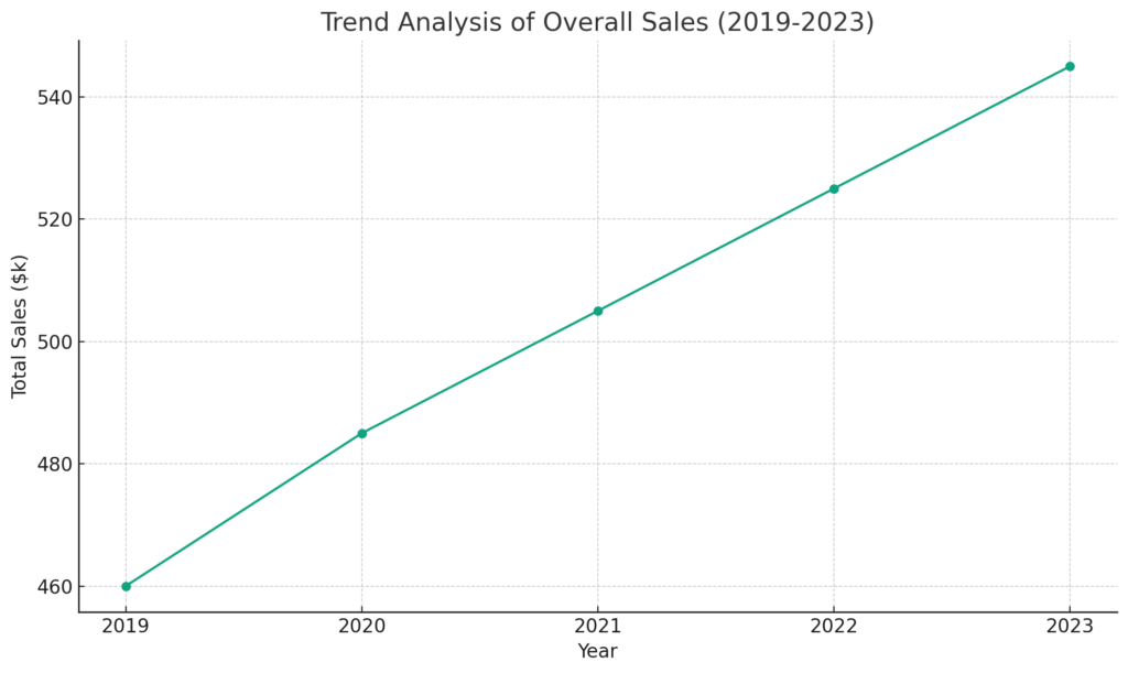
Trend Analysis of Overall Sales Over Five Years
- Data: Total sales from 2019 to 2023.
- Visualization: A line chart showing the trend in sales over the five-year period.
Now, I will generate a visual representation of this trend analysis.
Here’s a line chart visualizing the trend analysis of overall sales from 2019 to 2023. As you can see, the chart clearly depicts a steady increase in sales over the five-year period.
Next, let’s create a heat map for regional sales.
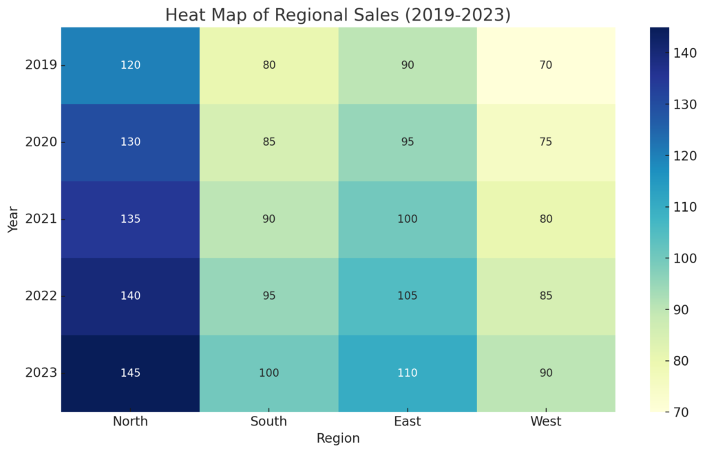
Heat Map for Regional Sales
- Data: Yearly sales figures divided into four regions: North, South, East, and West.
- Visualization: A heat map to illustrate sales performance in each region over the five years.
Let’s generate a visual representation of the heat map.
The heat map above illustrates the sales performance across four regions (North, South, East, West) from 2019 to 2023. In this visualization, the color intensity indicates the level of sales, making it easy to spot which regions are performing better or may require more attention.
Finally, let’s create a segmented pie chart for the product categories.
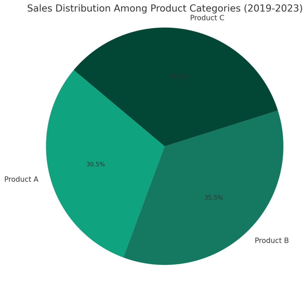
Segmented Pie Chart for Product Categories
- Data: Yearly sales figures divided into three product categories: Product A, B, and C.
- Visualization: A pie chart to show the sales distribution among these product categories.
I will now generate a visual representation of the pie chart.
Here’s a pie chart showing the distribution of sales among three product categories (Product A, B, and C) over the five-year period. The chart provides a clear visual representation of which product categories are contributing more to the total sales, making it easier to identify which products are performing well and which might need more marketing or development focus.
Together, these visualizations demonstrate how AI and data visualization tools in Excel can transform raw data into meaningful insights, aiding in better decision-making and strategy development.
Conclusion
Integrating AI with tools like Excel to visualize data is a game-changer for businesses of all sizes. It allows for a deeper understanding of complex datasets, revealing patterns and insights that might otherwise go unnoticed. Whether it’s charting growth trajectories or highlighting areas needing attention, AI-driven data visualization is an essential tool in the modern business toolkit.